NYC Rent-to-Income Ratio by Neighborhood : Where Rent Hurts the Most
In New York City, rent prices alone don’t tell the full story. What truly matters is how much of your income goes toward housing. This is where the rent-to-income ratio becomes critical.
In this analysis, we compare median rent and median household income across NYC neighborhoods to reveal where rent is most financially burdensome—and where it’s relatively manageable.
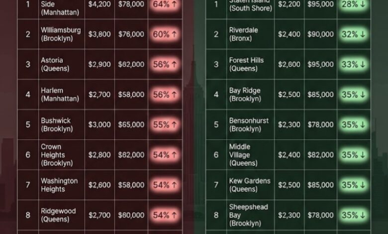
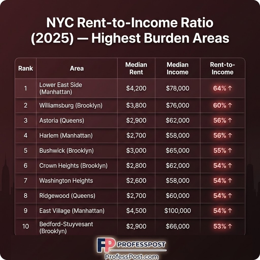
📊 Highest Rent-to-Income Ratios in NYC (Most Expensive Areas)
| Rank | Area | Median Rent | Median Income | Rent-to-Income |
|---|---|---|---|---|
| 1 | Lower East Side (Manhattan) | $4,200 | $78,000 | 64% |
| 2 | Williamsburg (Brooklyn) | $3,800 | $76,000 | 60% |
| 3 | Astoria (Queens) | $2,900 | $62,000 | 56% |
| 4 | Harlem (Manhattan) | $2,700 | $58,000 | 56% |
| 5 | Bushwick (Brooklyn) | $3,000 | $65,000 | 55% |
| 6 | Crown Heights (Brooklyn) | $2,800 | $62,000 | 54% |
| 7 | Washington Heights | $2,600 | $58,000 | 54% |
| 8 | Ridgewood (Queens) | $2,700 | $60,000 | 54% |
| 9 | East Village (Manhattan) | $4,500 | $100,000 | 54% |
| 10 | Bedford-Stuyvesant (Brooklyn) | $2,900 | $66,000 | 53% |
Key insight: In many of these areas, residents spend over half of their income on rent—well above the recommended 30% threshold.
📊 Lowest Rent-to-Income Ratios in NYC (Most Affordable Areas)
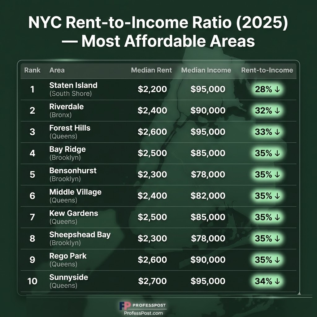
| Rank | Area | Median Rent | Median Income | Rent-to-Income |
|---|---|---|---|---|
| 1 | Staten Island (South Shore) | $2,200 | $95,000 | 28% |
| 2 | Riverdale (Bronx) | $2,400 | $90,000 | 32% |
| 3 | Forest Hills (Queens) | $2,600 | $95,000 | 33% |
| 4 | Bay Ridge (Brooklyn) | $2,500 | $85,000 | 35% |
| 5 | Bensonhurst (Brooklyn) | $2,300 | $78,000 | 35% |
| 6 | Middle Village (Queens) | $2,400 | $82,000 | 35% |
| 7 | Kew Gardens (Queens) | $2,500 | $85,000 | 35% |
| 8 | Sheepshead Bay (Brooklyn) | $2,300 | $78,000 | 35% |
| 9 | Rego Park (Queens) | $2,600 | $90,000 | 35% |
| 10 | Sunnyside (Queens) | $2,700 | $95,000 | 34% |
Key insight: These neighborhoods maintain rent levels closer to sustainable income ratios, often between 28% and 35%.
💡 What This Means for NYC Renters
NYC is not just expensive—it’s uneven.
- Trendy Manhattan and Brooklyn areas often exceed 50–60% rent burden
- Outer borough neighborhoods remain closer to the 30–35% healthy range
- Income matters just as much as rent when evaluating affordability
🔗 Related Articles
📊 Methodology
This analysis combines:
- Median rent estimates from housing market data (Zillow, rental listings)
- Median household income from U.S. Census Bureau (ACS 5-year estimates)
- Rent-to-income ratio calculated as monthly rent divided by annual income
All figures are approximations intended to reflect real-world affordability trends across NYC neighborhoods.
📚 Sources
- U.S. Census Bureau (American Community Survey)
- Zillow Rental Market Data
- NYC Housing Market Reports