America’s 25 Biggest Metro Areas Ranked by Housing Affordability (2026)

The Least Affordable Housing Markets Among America’s 25 Biggest Metro Areas (2026)
For generations, homeownership has been one of the clearest paths to building wealth in America.
But in many major U.S. housing markets, local incomes and home prices no longer seem to live in the same universe. In some metro areas, buying the median-priced home requires nearly 10 times the median household income—a gap that raises serious questions about affordability, financial sustainability, and whether homeownership still makes sense for average earners.
This analysis compares major U.S. metro areas using a straightforward affordability benchmark: the relationship between median home prices and median household incomes.
The results show where housing has become most detached from local earning power—and where the gap remains comparatively manageable.
If broader wealth-building trends interest you, see our breakdown of the best U.S. metro areas to build wealth from scratch.
America’s Most Detached Housing Markets
At the top of the list sits Los Angeles.
With a median home price of $980,000 and median household income of just $98,000, the price-to-income ratio lands at an astonishing 10.0x.
That means the typical home costs roughly ten years of gross household income—before taxes, before living expenses, and before interest.
That’s not affordability. That’s financial altitude sickness.
San Jose and San Francisco are close behind, both at 9.7x.
These metros benefit from exceptionally high salaries compared with most of the country, but housing prices have climbed even faster.
In tech-heavy markets, strong incomes haven’t solved affordability—they’ve often helped fuel the problem.
New York Still Punishes Buyers
New York City’s metro area posts a ratio of 8.6x.
Even households earning nearly six figures are effectively priced far outside comfortable ownership territory unless they bring substantial savings or outside capital.
This helps explain why many New Yorkers build wealth through renting strategically rather than rushing into ownership.
For a broader wealth perspective, our analysis of how long it takes average households to reach $1 million net worth in NYC neighborhoods offers an interesting comparison.
Miami’s Housing Reality Is Worse Than Many Expect
One of the most surprising entries is Miami.
At 8.2x, Miami ranks above Boston and Seattle.
That reflects a combination of migration demand, international buyer interest, and home prices that have risen much faster than local wages.
While Florida’s lack of state income tax often attracts higher earners, that advantage doesn’t magically make housing affordable.
Boston and Seattle Aren’t Cheap—But They’re More Rational
Boston (7.5x) and Seattle (7.1x) remain expensive by almost any standard.
But compared with Los Angeles or San Jose, the relationship between income and home prices is at least somewhat less extreme.
That distinction matters.
High-cost metros are not all equally irrational.
Where the Housing Math Starts Looking Less Broken
The bottom half of the ranking looks far less punishing.
Markets like:
- Dallas (4.7x)
- Jacksonville (4.7x)
- Chicago (4.5x)
- Houston (4.4x)
- San Antonio (4.4x)
- Indianapolis (4.1x)
These are hardly “cheap” by historical standards—but they remain dramatically more accessible than coastal extremes.
That helps explain migration trends toward lower-cost metros.
It also aligns with our look at U.S. cities where household incomes grew the fastest.
How This Compares to Salary Perception
Housing affordability also changes how Americans perceive income.
A six-figure salary sounds impressive nationally.
But in markets with 8x–10x price-to-income ratios, even strong earners can feel financially boxed in.
That mirrors the findings in our $150K salary reality check.
Income alone doesn’t define comfort anymore. Housing does.
What About High Earners?
Even households earning $200,000+ aren’t automatically “safe” in certain markets.
Our $250K salary vs America’s wealthiest ZIP codes comparison shows how quickly expensive real estate can erase what looks like elite income on paper.
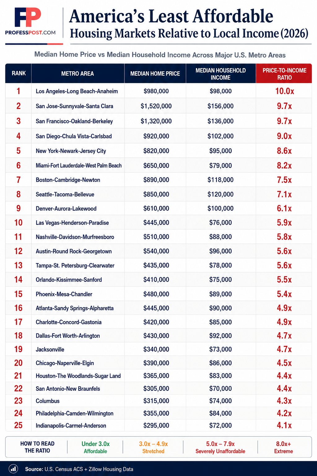
Full Ranking: Least Affordable Major Housing Markets
| Rank | Metro Area | Median Home Price | Median Household Income | Price-to-Income Ratio |
|---|---|---|---|---|
| 1 | Los Angeles-Long Beach-Anaheim | $980,000 | $98,000 | 10.0x |
| 2 | San Jose-Sunnyvale-Santa Clara | $1,520,000 | $156,000 | 9.7x |
| 3 | San Francisco-Oakland-Berkeley | $1,320,000 | $136,000 | 9.7x |
| 4 | San Diego-Chula Vista-Carlsbad | $920,000 | $102,000 | 9.0x |
| 5 | New York-Newark-Jersey City | $820,000 | $95,000 | 8.6x |
| 6 | Miami-Fort Lauderdale-West Palm Beach | $650,000 | $79,000 | 8.2x |
| 7 | Boston-Cambridge-Newton | $890,000 | $118,000 | 7.5x |
| 8 | Seattle-Tacoma-Bellevue | $850,000 | $120,000 | 7.1x |
| 9 | Denver-Aurora-Lakewood | $610,000 | $100,000 | 6.1x |
| 10 | Las Vegas-Henderson-Paradise | $445,000 | $76,000 | 5.9x |
| 11 | Nashville-Davidson-Murfreesboro | $510,000 | $88,000 | 5.8x |
| 12 | Austin-Round Rock-Georgetown | $540,000 | $96,000 | 5.6x |
| 13 | Tampa-St. Petersburg-Clearwater | $435,000 | $78,000 | 5.6x |
| 14 | Orlando-Kissimmee-Sanford | $410,000 | $75,000 | 5.5x |
| 15 | Phoenix-Mesa-Chandler | $480,000 | $89,000 | 5.4x |
| 16 | Atlanta-Sandy Springs-Alpharetta | $445,000 | $90,000 | 4.9x |
| 17 | Charlotte-Concord-Gastonia | $420,000 | $85,000 | 4.9x |
| 18 | Dallas-Fort Worth-Arlington | $430,000 | $92,000 | 4.7x |
| 19 | Jacksonville | $340,000 | $73,000 | 4.7x |
| 20 | Chicago-Naperville-Elgin | $390,000 | $86,000 | 4.5x |
| 21 | Houston-The Woodlands-Sugar Land | $365,000 | $83,000 | 4.4x |
| 22 | San Antonio-New Braunfels | $305,000 | $70,000 | 4.4x |
| 23 | Columbus | $315,000 | $74,000 | 4.3x |
| 24 | Philadelphia-Camden-Wilmington | $355,000 | $84,000 | 4.2x |
| 25 | Indianapolis-Carmel-Anderson | $295,000 | $72,000 | 4.1x |
Methodology
This analysis compares major U.S. metro housing markets using the price-to-income ratio, a commonly used affordability benchmark that measures how detached housing prices are from local earning power.
The formula is simple:
Median Home Price ÷ Median Household Income = Price-to-Income Ratio
Higher ratios indicate less affordable housing relative to what local households typically earn.
General affordability benchmarks:
- Under 3.0x = Affordable
- 3.0x–4.9x = Stretched
- 5.0x–7.9x = Severely Unaffordable
- 8.0x+ = Extreme
Metro-level housing price estimates and household income figures were compiled using publicly available U.S. datasets for editorial comparison.
Sources
- U.S. Census Bureau — American Community Survey (ACS)
- Zillow Housing Market Data
- Regional metro housing affordability benchmarks
Final Thoughts
America’s housing crisis doesn’t look the same everywhere. But one thing is clear: in several major metros, home prices have moved far beyond what local incomes can realistically support.
At some point, affordability stops being about budgeting—and starts being about structural disconnect.
Would you buy a home in a market where the median price is 8x or 10x local income?